Sunday, 7 April 2013
Thursday, 14 March 2013
How did you use media technologies in the construction research, planning and evaluation stages?
Throughout our project we have used various media technologies ranging from Microsoft to iMovie and have used these technologies on apple Macs and computers, in order to gain general knowledge and experience using technologies available to us as a group.
Microsoft
Microsoft Word, PowerPoint and Excel were the three programmes which we utilized during our research, planning and evaluation stages. There were a few evaluative points as to why we chose to work with the aforementioned softwares. Collectively, we felt that PowerPoint would work well in allowing us to make small alterations and the programme had the font which we wanted to use throughout our three media products - Didot. Furthermore, in retrospect, PowerPoint was effective for us to use as it is lived up our ideas on how to create the billing block, the writing on our film poster and magazine.

Similarly, we exploited the uses of Microsoft Excel to illustrate the results which we received from the two surveys that we sent out. After having gathered all of the participant's results, Excel was extremely helpful in allowing us to visually and statistically see where the majority of answers laid.
Meanwhile, Word acted as a way for us to clearly and logically write down all of our ideas, from filming schedules and costumes lists to trailer ideas... Using this programme was a better use of our time rather than just talking about what we were going to do, which is what we did last year.
To conclude our experience of using Microsoft during our trailer project, we feel that without it, perhaps we would not have been able to make changes to our poster and magazine drafts as easily. Moreover, as we have been using Microsoft for years, each of us knew our way around the programmes and we did not encounter any problems that we could not fix. Other benefits which we noticed whilst experimenting with each of the programmes, was that they did not creatively restrict us; they enabled us to bring to life our designs without any hassle - due to the fact they had a large library of tools for us to make use of.
Microsoft Excel helped to show accurate figures and percentages of responses which stemmed from our questionnaires - this assisted us when we had to make a decision on the direction of our A2 trailer.
However, we feel that there are a couple of disadvantages of exploiting Microsoft as a way to construct and edit our film poster and magazine - the main issue being that within the media industry Microsoft may not be seen as a professional programme to create the specific media products, such as the posters and magazine covers. Additionally, another downfall of Microsoft - PowerPoint in particular is that the software does not offer the advanced tools like Photoshop.
Green Screen

Within one of our media lessons we researched conventions of film magazines and posters and how the industry creates that cinematic/professional look, it was then that my group and I decided to operate the green screen. Towards the end of the session, it was a mutual agreement that we will not be using it when producing our final media products.
Even though we did not experiment using this particular facility that our school has to offer, we understood that it is used to eliminate anomalies within images such as shadows and inconsistent lighting. In addition, we knew that this was the only way to achieve the solid/gradient background that the magazines usually apply, however we felt that we were lacking in 'know-how' of how to edit the footage once uploaded to Final Cut Express.
It would have been effective to use the green screen in our final ancillary products as it would further our knowledge and help us to replicate procedures which are adopted within the industry. Moreover, the screen would work well in terms of continuity as there would be no lighting issues.
The internet acted as a portal for us to aid our research, construction, planning and evaluating.
YouTube Official Film Website
Odeon
IMDb
Facebook.
Facebook was used when evaluating, this was effective in getting
feedback because those commenting would be those who were in the target
audience range of our trailer.
However the disadvantages of using Facebook as a means to
receiving feedback is that the responses are not very descriptive and much of
the feedback was not very detailed as many individuals do not know what to look
for in a trailer. Areas which did not get commented on where the mise-en-scene
as many did not know what aspects it addresses.
Out of all the websites which we looked at YouTube throughout all
the stages and it proved itself to be the most sufficient. The reasons for this
are that it provided us with templates of previous thriller trailers, Adobe
after effects tutorials inspiration for our trailer soundtrack.
The advantages we found from YouTube is that we can directly
upload videos from YouTube up onto our blogs with ease. Furthermore there was
an unlimited amount of trailers we could browse through.
The disadvantage is that people can upload fan made videos and at
times can be very similar to the real thing. This caused us to spend more time
searching for the official trailers. Bad quality videos can be uploads which
again was time consuming as we then needed to search for the video with good
quality sound and viewing.
The International Movie Database assisted us in our research
process mainly as it helped us to identify what movie production companies
sponsored which films, and furthermore, what distribution companies
collaborated with them.The resourcefulness of the IMDb allowed us to look at vital
information, this website acted as a library where we could view any film
trailers and facts about the films, for example who was involved in creating
the movies. Another advantage of this site is that it is constantly being
updated; therefore all of the information is current. In light of this, a
drawback of IMDb is that without internet connection, you cannot obtain its
facts.
Official film websites were used when planning and researching,
this allowed us to get a general overview of the professional promotional
packages. We looked at official film websites in great detail to analyse the
font styles they used and the positioning of images and text. In addition we
looked at how they marketed their film and which conventions were broken or
adopted. When looking at the film websites it showed their creative expression
and opened our minds to the different paths we could explore when producing our
promotional package. This is an advantage of official websites as it broadened
our minds to the possibilities and options.
The disadvantage to our group is that some films do not have a
website or in some cases the film is very old so the website no longer exists;
and in our case many good thrillers are from a few years back.
Another disadvantage is many films do not use the official website
as their main way to marketing, resulting in a very basic site.
Programmes
 During the construction and planning phases we started by working
on final cut express, this was to create the storyboard and acted as a base for
later development within our project. Our reasoning behind utilising this piece
of software was down to our previous knowledge gained last year, where we
created our thriller film opening. We knew that we would be capable of
constructing an effective trailer which will evoke the feeling of suspense, due
to our successful use of transitions and filters which Final Cut Express
offered.
During the construction and planning phases we started by working
on final cut express, this was to create the storyboard and acted as a base for
later development within our project. Our reasoning behind utilising this piece
of software was down to our previous knowledge gained last year, where we
created our thriller film opening. We knew that we would be capable of
constructing an effective trailer which will evoke the feeling of suspense, due
to our successful use of transitions and filters which Final Cut Express
offered.

Final Cut Express is a programme which we were made aware was used
by professionals; we wanted to duplicate that cinematic effect which they so
well achieved. A noted benefit was that Final Cut allowed us to unite the
visual and audio elements. When applying an effect onto footage the programme
gave us freedom to either stick to the default settings or adjust as we wish.
The disadvantages of final cut were that the camera did not
download directly on the program it needed to go through iMovie and be exported
as an XML. This was just an inconvenience to our group as it was time
consuming.
Also to those that have little knowledge in Final Cut Express it
would be very difficult to teach yourself.
Lastly as we were producing a thriller trailer we wanted to
include a sequence of very fast paced shots, synchronised with a soundtrack;
sometimes when deleting footage the continuity between the visual and audio
elements were distorted. We found this extremely time consuming and testing on
our skills.
 Photoshop was used when planning and constructing in order to aid
work with the promotional package consisting of a film poster and film
magazine. This programme was used in order to explore the different conventions
which are showcased in thriller posters, for example the use of a spot light
tool to emphasize the girl’s situation.
Photoshop was used when planning and constructing in order to aid
work with the promotional package consisting of a film poster and film
magazine. This programme was used in order to explore the different conventions
which are showcased in thriller posters, for example the use of a spot light
tool to emphasize the girl’s situation.
When constructing the poster, Photoshop was required to
help edit the original image. The lighting was corrected along with the
surrounding area. The ground was very patchy in places and some had no leaves
covering the ground.
The advantage of Photoshop is that it is a professional programme
which is used in the media industry; so if we had advanced skills and time we
would be able to use the functions and tools available to us to create a
professional edit of a film poster.
Another advantage is that a member of the group studies A level
Photography so had previous knowledge which made using Photoshop easier. Photoshop acts as a magnifying glass which allowed us to
scrutinize even the smallest areas of the poster to allow correction.
The disadvantage of this programme is that an introduction is needed
due to the intricacy of the tools available as many only differ in use
slightly.The programme is very time consuming even to just carry out one
task such as cropping round an image because if it goes wrong half way through
you need to start over.
The positive of using this software is that on YouTube there are a
number of tutorials that can guide you through the programme to create an
effective shot. This made this part of the constructing process bearable and
seem less alien to the group. However it was time consuming and frustrating. Another bonus is that this programme is a well renowned piece of
software amongst the experts and would looked high quality when accomplished.
Despite those points, Adobe After Effects is such a detailed
programme that at any stage something could go wrong and it could be very
difficult to backtrack and pinpoint what needs to be altered. We felt that
without the use of following a tutorial as a group, we would not have
understood the first thing on how to go about constructing such an animated
title. What is more, the programme is very expensive to install, it is
for this reason that we tested the free first month trial. The negative about
using the trial version of Adobe After Effects is that it is limited in some of
the effects which the full version buys, for example the “Knoll Light Factory”.
The benefit of having a programme such as iMovie at our disposal
is that it does have a wide variety of transition options which would be
suitable for any type of genre and as there is a library of effects, it makes
the editing ordeal less time consuming. Furthermore, the fact that the software itself can lay out a
template for you to follow when creating a trailer, can prove itself to be very
effective as the template acts as a guarantee to having a well thought out,
fluid trailer.
On the other hand, there are drawbacks of exercising iMovie, for
instance, if you did use a template, it does restrict your creative development
which you would generally experience in a non-restricting process.
Additionally, there is general feedback from people who have used
the programme and they have said that on the whole, it is difficult to import
videos from the internet directly to iMovie, such as YouTube. This makes adding
the film production companies very testing to upload and put at the beginning
of the trailer.
Garage Band

In order for us to create our soundtrack for our trailer, we needed to utilize the apple programme called Garage Band.
Last year we had used this software in order to create a deep, manly, demanding accent, however we had not experimented with the voice and instrument loops, in addition to the editing aspects such as volume, pitch and repetitiveness of the tracks.
The advantage of Garage Band is that once the soundtrack has been created it is quick and easy to export that file into a .mp3 and a .mov. This proved effective when we needed to upload the soundtrack to our film trailer in Final Cut Express. Another advantage is that the programme allowed us to make as many changes as we needed whilst it was still in the garage band format. Seeing as we were constantly adjusting our soundtrack this was a helpful element.
The main disadvantage that we encountered whilst constructing our soundtrack is that changing the tempo within the file is not possible. Upon reflection this did not cause too much concern for our group as when
imported into Final Cut Express tempo changes could be done on that program.
Equipment
Camera

As opposed to year 12, this year we had new camcorders in order to capture our footage and take our stills shots for our tester poster and magazine. These cameras were of significantly better quality and had features such as face tracking and a memory card.

As opposed to year 12, this year we had new camcorders in order to capture our footage and take our stills shots for our tester poster and magazine. These cameras were of significantly better quality and had features such as face tracking and a memory card.
The camera was used in the planning stage in order to experiment
with shots and become familiar with the technology. When constructing the
cameras were relied on greatly as they were required for every session.
The advantage of having the camera that we did was the high
quality that could be produced when videoing or taking still shots. The focus
for a long distance range was still very clear which was an advantage to our
group as it did not hinder when we were trying a wide variety of angles and
movements with the camera.
The main disadvantage was that on the market there are still
cameras which are of higher quality which would have been better in picking up
detail in darker shots.
The cameras provided for us are not take of professionals in the
industry as theirs are very expensive and produce the highest of quality, and
this is something which we as a group do not have access too.
- By Katie and Grace
Wednesday, 13 March 2013
What have you learnt from your audience feedback?
Audience feedback
Audience Feedback is crucial in allowing a product to evolve into a well formed and received film trailer/poster/magazine. With this in mind we made sure to ask for feedback throughout our whole researching, planning, editing and producing stages in order to keep us along the right path and not divert our attention to menial things that could change the look or continuity of our products altogether.
Unlike last year, this time we constructed two questionnaires as a source for feedback, in addition we approached Facebook and filmed some first time responses after having looked at our promotional package and held a number of viewing sessions.
TrailerUnlike last year, this time we constructed two questionnaires as a source for feedback, in addition we approached Facebook and filmed some first time responses after having looked at our promotional package and held a number of viewing sessions.

At the end of the long process of constructing the trailer, we asked a hand full of individuals if they could watch our Queensdown Warren film advertisement. Their ages ranged by three years, they were mainly 15-18 years of age.
Issues that were bought up derived from the lack of shots portraying all three girls together. Whilst this was valid point, we felt that in order to achieve the feelings of isolation within our trailer, it was more useful to us to not show her with her friends. In addition, the main girl is the character who carries the film's message of resisting and fighting situations which you did not plan to be put in.
We thought it would be effective to have two friends which could symbolize what would happen to people if they did not fight, and as there are two or them, and two of the men it would reinforce the power that they had over the girls.
On the other hand, our audience expressed their fondness of the contrast between the fact paced shots and the slow motion leaf falling shot. They said that they thought they worked well in highlighting the calmness which is usually associated with the countryside and the fast moving shots to resemble the fast moving life of the city.
Moreover, another element which caught their eye was the ending shot where the girl is being dragged and then the camera goes out of focus. It was noted that this was particularly effective as it directly showed the audience the girl's perspective and how we wanted our target audience to sympathize with the girls.
Reflecting on the usefulness of organizing feedback sessions, we felt that it was a quick and easy way of collecting opinions on our work and this meant that we were able to correct any issues with immediacy. Also, by holding these viewings it meant that while the people we were watching our trailer we could attain their reactions and this was useful to know. It informed us where we needed to make the soundtrack louder or a shot clearer.
Overall, I think we would use this method again to gain consensus of opinions on our work as it is a quicker way to in effect, perfect our work to a higher standard. However, the only negatives that this approach has to offer is that it does not have that element of anonymity which questionnaires and blogger comments have. They may have felt under pressure to give the same opinion of others within the focus group.
Magazine
As useful as it is, getting feedback from media students, we realised that it can be more important to get opinions off those who are not inclined to be thinking in terms of - what does that shot connote? and the lighting here suggests... We also learnt that obtaining outsider's thoughts on our work would give us a fresher perspective on how our version of a Total Film magazine cover looks in comparison to others, and whether we have established a consistent brand that evokes the 'must see' feeling.
With the magazine cover that we thought of adopting the viewing/Q and A session once again, as it proved itself very effective with our trailer.
Advantages of Q and A session
- Produced instant results
- Results were rich with detail
- If responses were unclear, we could ask them to elaborate
- Face to face technique worked well in allowing us to see their facial reactions
- Social desirability, the participants may say what they believe the rest of the people are thinking in order to gain respect or feel equal to everyone else
- Pressure in acting a certain way in front of us, so they do not offend
Responses to our magazine overall was positive with people saying that the girl's poses and expressions were very good in showing fear (this response shows continuity in our three products) and that in terms of achieving a cover that looks professional, we have managed to do so.
Despite all of the good points, there was one critique, and this was that the words Queensdown Warren did not stand out very well against the girl's navy hoodie. Due to this, we highlighted the font in bold however it did not make much of an improvement. The reason why we did not change it further is because we would have had to change to font, and for continuity purposes this was too much of an alteration.
Poster

Lastly out of our three products, we learnt that our poster was very professional looking and would not stand out amongst other posters that are displayed outside of a cinema, like Odeon, for example.
It was through the Facebook website that helped our poster to develop in the earlier stages, as we posted the image to the left there were both positive and negative comments. There was a desire that they expressed to see more of the girl's surroundings. As a group we felt that this was a reasonable idea and by make the overall expression of the poster lighter, it would help people to see the boys in the background much better and increase the feelings of danger upon the girl.
After we had made the changes someone stated ‘the two men in the background look intimidating and stronger than the girl.’ This is positive feedback because as a group this was the vibe or expression we hoped the audience would see now.
It was important to us to receive opinions from people our age so we can tell if we had achieved what we set out to do, to produce an effective, conventional thriller trailer than manages to make our audience feel something towards the characters. In light of this, Facebook was extremely helpful as it is a very
interactive site and we could spread our trailer/poster and magazine cover across Facebook to address a mass audience, relatively
quickly.
- By Katie and Grace
Tuesday, 12 March 2013
In what ways does your media product use, develop or challenge forms and conventions of real media products?
Over the years ideas and types of shots have been copied and displayed in a number of films, which have, in effect have turned into conventions that the audience identify with and analyse. Conventions can be seen to vary depending on the genre. For example, characters are displayed differently by the way they dress and talk, lighting emphasizes who the victim.perpetrators are and stereotypical shots can foreshadow later events.
Whilst developing ideas for our three media products we had to
adopt and challenge forms and conventions used in real media products, in order
to produce and make our ideas materialise.
Magazine
 Our magazine adopted an array of forms and conventions to allow us to make our work look like that of a professional. Following are the points
which show how we adhered to other real media products.
Our magazine adopted an array of forms and conventions to allow us to make our work look like that of a professional. Following are the points
which show how we adhered to other real media products.

At the beginning of making our product we initiated research into
the mass market film magazine companies and the niche magazine titles such as
Sight and Sound. We decided after much deliberation that Total Film would work best for us as it had a very
specific layout. Furthermore, we entertained the possibility of going with Total
Film because of its worldwide reception and this meant that we would able to have the image covering part of the title.
Items which are frequently featured on the magazine cover are things such as the barcode,
price, website, date and issue number. On our rendition of a film magazine it is evident we have stuck to these aspects as we included them in our overall design, we also kept them in the same position on the cover.
Another main feature that is displayed on the front of any film
magazine is that the individuals are posing in character and looking directly
down the barrel of the camera, and are not sporting an action pose. On our Total Film cover
each of the characters are seen in the costumes that they were wearing in the trailer, whilst maintaining an expression of
helplessness. This links in with our ancillary texts as they are depicting the girls shock and unreadiness.
Within the magazine product another convention which has been used
is gripping phrases such as “mind blowing” and “starring” which capture the
audience’s attention whilst glancing at the magazine. Phrases such as these are
put into a large font in order to stand out from other text on the page.
Without phrases the cover could just be consumed by text which does not excite
the audience.
A characteristic of film magazines are that the cover shows what
the main articles are enclosed inside. With our magazine we have done just
that, as it states “Iron Man 3 full cast interview”. In addition, there is an
article for Stoker the new film which has been released.
There were times during the constructing of Total Film in which we
felt compelled to challenge the magazine’s normalities. The incidences in which
we challenged the conventional form are when we applied the background and
number of characters which featured on the front.
Firstly, when we gathered audience feedback it was mentioned to us
that our use of background was not a common attribute for any film magazine.
Simultaneously after this piece of information we launched an inquiry and
discovered in actual fact some covers do involve a background, for instance, in
the Total Film repertoire there is a cover advertising Sherlock Holmes and just
behind in the blue mist you can just about visualise Big Ben. After having
looked into examples which display the main setting of the film on the
forefront of the magazine, we felt at ease to not alter our rendition of Total
Film. The dark green metal container which the girls are standing in front of
was chosen in our planning stage as it symbolised the clash of the urban and
countryside elements which intertwined in Queensdown Warren. Furthermore, as a
group we talked of going onto feature a shed of some description in our film at
some point if we were to shoot the rest of the film.
The second convention that we challenged is the image; a general
aspect of a film magazine is that there is only the main character on the
cover. However, there are occasional incidents where there is more than one
character advertised. Examples of this are the Twilight and The Lord of the
Rings issues. We as a group decided to use three characters also; and the
reasons for this are the strong bond and the experience in which the three
girls shared. One of the major themes within our trailer was isolation and we
thought it would best be reinforced in our other media products by displaying
them together.
Trailer
It is within the trailer's aim to illustrate the characters, story line and genre with complete conviction and to make the audience feel enthralled by the trailer, enough so that they want to go and see it.
This can be achieved by the number of shots which are exploited throughout the film advertisement. Depending on the context in which the shots are used, they can illustrate location, status, character's reactions, age and emotions. An example of how my group and I followed some conventional shots of the thriller genre, is when the audience can see that the main girl is being dragged away by her feet. We aimed to include this shot as it was conventional and would be effective in reinforcing our genre, also by allowing the audience to see that the girls are not in control of their lives and are being manipulated. This iconic shot can be spotted in the Quarantine and Sorority Row films. In addition, we also applied this shot to the very end of our trailer as we felt it would work well in gripping the audience and make them unconsciously invest in their emotions, in particular the sense of irritation as the girls are so helpless, and intrigue as they will want to know what will happen to the girl.
One way in which we conventionally displayed the contrast of the character's dispositions was in our use of extreme close ups. Our reasoning for wanting to utilize a number of close ups was so that we could show the binary opposition theory as each of the shots would show the contrasting costumes and body language.

In light of binary opposites, the effectiveness of showing the girls in the country and the city helped us to further display the theory of binary opposites. When we were researching we watched the trailers for “Shark Night”, “Wrong Turn” and a film called “The Ruins”, in each of the trailer's narrative they placed their characters in two different locations, one where the characters start their day and the other where the event occurs which shifts the equilibrium. In terms of setting we decided to adhere to this convention as it is extremely effective in highlighting the severity of the situation which the girls find themselves in.
To add to the list of elements which we have adopted from real media products, the text shots which we inserted into Queensdown Warren was something that we felt would add to our trailer as they have the potential to increase the feelings of anticipation and work in reinforcing the narrative of our film.
“What started as a camping trip... Ended as... A fight for survival” is the sentence which we inserted into our trailer in three parts.
“What started as a camping trip... Ended as... A fight for survival” is the sentence which we inserted into our trailer in three parts.
Poster

There is an array of conventions which we have implemented to our poster, from the billing block to the lighting.
In the early stages of editing the final photo, light was one of the first issues that we addressed.
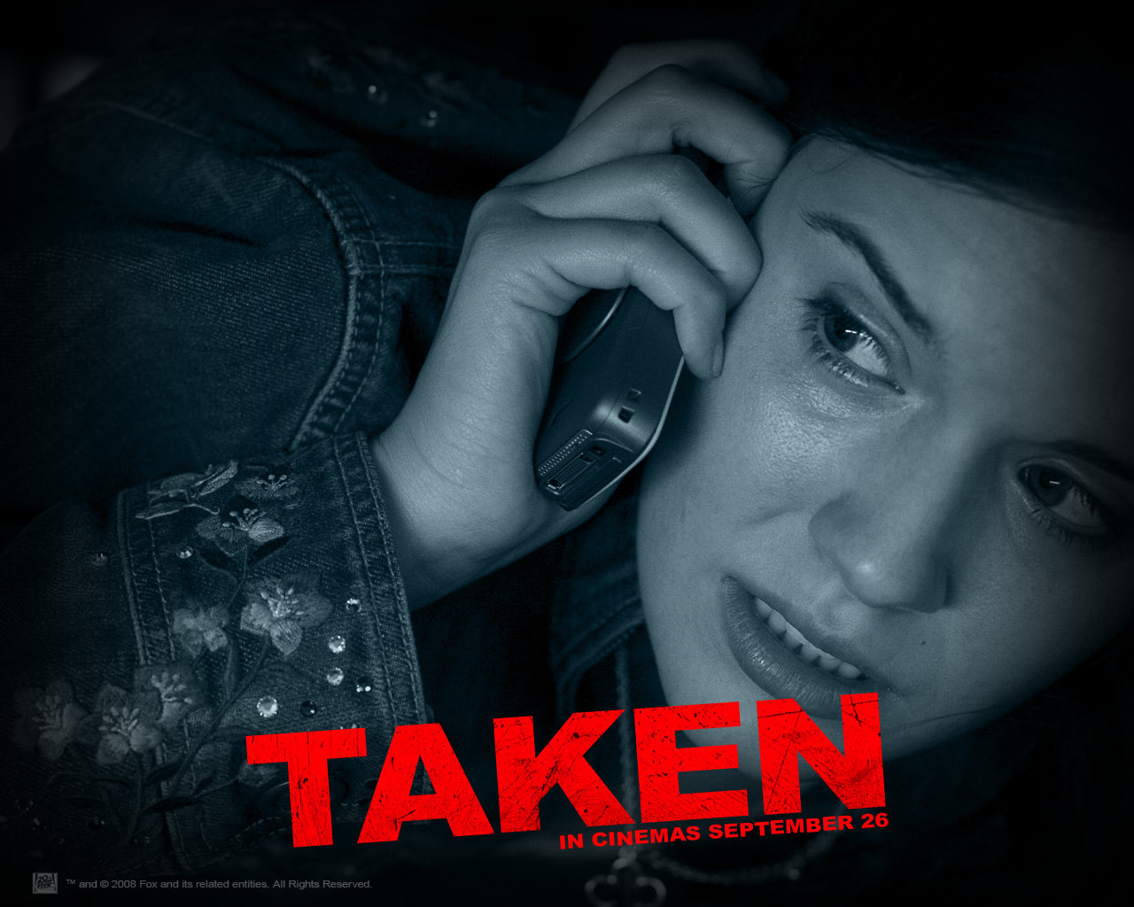
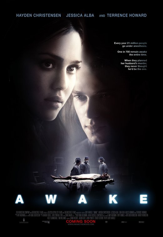
Having looked at other thriller posters whilst in the research process, we saw that the light was used to highlight who the victim or the protagonist of the film was. "Awake" starring Jessica Alba is one poster that we drew inspiration from and evolved the idea of using a spotlight the emphasize who our protagonist was.
On our poster we felt like the light focusing on the girl would work extremely well in highlighting her 'angelic-like' character in contrast to the two boys who are featured in the background. Furthermore, as she is surrounded by dark lighting and the figures behind her are focusing on her, it shows that she is going to be subjected to their attention and its represents how she is thinking that they are closing in on her.

Costumes was something which we did not take long to decide on, this is because the age of people that we were basing our film on were of the same age as we are. It was a quick decision to dress the girls in normal camping wear and the boys in a tracksuit. Similarly, these aforementioned outfits is what is commonly seen in films which carry the theme of youths. E.g. Kidulthood and Adulthood. To sum up, the antagonists will be dressed in the colour black or any other dark colour, like grey and they will be covering their faces with their hoodies. This is so that their identity is kept a secret and a mystery to keep the element of surprise and to stick to a convention. On the contrary, the victims will be wearing lighter colours which will act as a reinforcer to the audience of who the 'goodies' are.
Costumes was something which we did not take long to decide on, this is because the age of people that we were basing our film on were of the same age as we are. It was a quick decision to dress the girls in normal camping wear and the boys in a tracksuit. Similarly, these aforementioned outfits is what is commonly seen in films which carry the theme of youths. E.g. Kidulthood and Adulthood. To sum up, the antagonists will be dressed in the colour black or any other dark colour, like grey and they will be covering their faces with their hoodies. This is so that their identity is kept a secret and a mystery to keep the element of surprise and to stick to a convention. On the contrary, the victims will be wearing lighter colours which will act as a reinforcer to the audience of who the 'goodies' are.
Another contributing factor that we conventionally used on our
poster was text. We considered how to display our film title, film tagline and the billing block at the bottom of the poster. We stuck with the more conventional shot for our billing block and put the cast and crew's names all on one frame. It was a natural development that we went from a white billing block to a more sophisticated, professional grey billing
block, this also was effective as the colour grey did not distract you from the main picture.
Queensdown Warren can be noted for challenging certain conventions, such as the font style we exploited in all three of our media products. Our font - Didot, was chosen partly because of the "Q", it looked very regal and considering the name was Queensdown, we thought that the font accompanied the title well. However, from having looked at a large collection of thriller film posters, it is apparent that our font is not as bold and relevant to the thriller genre. Additionally, some could say that we have not applied any special animation effect to our title and this is becoming less conventional as the years go on and technology is becoming more advanced. As an instance, keeping in mind the genre and narrative of Queensdown Warren, if we were to do something like this assignment again we could include a blood animation or intelligent theme shown in the letters of the title. However, this year we believe that we did not require the use of animation of that level as space was an issue and we agreed it could make our products look busy.
Queensdown Warren can be noted for challenging certain conventions, such as the font style we exploited in all three of our media products. Our font - Didot, was chosen partly because of the "Q", it looked very regal and considering the name was Queensdown, we thought that the font accompanied the title well. However, from having looked at a large collection of thriller film posters, it is apparent that our font is not as bold and relevant to the thriller genre. Additionally, some could say that we have not applied any special animation effect to our title and this is becoming less conventional as the years go on and technology is becoming more advanced. As an instance, keeping in mind the genre and narrative of Queensdown Warren, if we were to do something like this assignment again we could include a blood animation or intelligent theme shown in the letters of the title. However, this year we believe that we did not require the use of animation of that level as space was an issue and we agreed it could make our products look busy.
Monday, 11 March 2013
How effective is the combination of your main product and ancillary texts?
Our aim throughout our whole project was to make sure that there was a continuity in all of our three media products in order to produce an effective promotional package and reach a degree of professionalism. During each of the necessary stages in developing the three texts we concentrated on the following:
- Fonts and Texts
- Facial Expression
- Body Language
- Lighting
- Costume
- Themes/ Emotions

Fonts/Text
From the images above it is evident that we tried to keep the fonts of the film title the same, our reasoning behind this was so that people would then familiarize the Didot font with our film, much like individuals can clearly associate the white, bold, shadow-like font with the film The Woman In Black. The continuous use of the colour red was to help symbolize the aspects of fear, danger and blood from the victim's point of view and also, keeping in mind the antagonists; the red connotes anger and a passion to inflict pain on others for no connected reason. In contrast to the two ancillary texts, the colour black was used to display the film title in the trailer and this was to imply the thought and recurring message that people find comfort in the familiar and connect the unknown with fright and an anticipation that something dreadful will occur.
When we were experimenting with colour schemes, we found out that one of the conventional colours applied to thriller products were black, white, grey and red. It was an immediate and respective decision to dismiss white as we felt that an audience could read into a major theme being innocence and whilst we did want to represent that subject, our main focus was to command the audiences attention to the fear, struggle and manipulation.


Body Language
Each of the poses which the girl is holding expresses the notion of being vulnerable and manipulated by a force stronger than herself. The girl's body language in the poster reads that of having physically dragged down by the men as the torment has ceased and wearied her to the ground. Furthermore, this is reinforced by the contrast of the men's poses as they are seen to be standing strong and in command as if they are of a much higher status, both physically and mentally. Within the film magazine cover, even though there is the absence of the predators and she is not crawling on the floor, her body language signifies her unreadiness in having to direct herself back into the familiar and defending herself against her manipulators. This is shown by her hands, they are not clenched which shows that her reaction to the situation is somewhat delayed. Moreover, she has adopted a slight hunched posture which does not tell the audience that she is alerted by anything, however her facial expression does display that she has sensed something is not right.
As the two ancillary texts have stationary poses and a trailer is in motion, it makes it difficult to choose a pose, however the snapshot of the girl running up the hill, I believe is a perfect motion picture summary of what the other two products demonstrate. It shows the interaction between the three of them and is exemplar in visually capturing the binary opposition theory. Good vs. Bad / Prey vs. Predator

Lighting
From the collage at the top of this blog it is evident that we played around with the lighting aspect of all three of our media products. Within our Queensdown Warren trailer the light element is extremely important not just within the footage that we filmed, but also in our film title shot. The red light is significant as it surrounds the black text highlighting the mysteriousness of the unknown and makes the question ask "What will happen at Queensdown Warren?" In conclusion, that shot is very effective as it is enticing our audience in and putting our title in their minds so that they would remember our film and want to go and see it.
In terms of natural lighting, it was also useful in moving our plot along and helping to define that our trailer is not in chronological order, which is a convention in every trailer genre.
The artificial lighting, in both the magazine and the poster both are linked by the definition on the central girl. Whilst we were editing we had the ability to change the lighting focus at our disposal, and used it as a tool to strengthen our themes and message most importantly. This is effective, by homing in audience's attention on the prime example of someone who seems in control of their live, and then exploiting her reactions when someone else changes her life for her.
- By Katie and Grace
Sunday, 10 March 2013
Movie Title Trials - Adobe AE
After having watched many thriller trailers, we felt it was an obvious notion not to opt out for a solid black background to display the shot with our film title on. The rationale behind this was that initially during the production of the animatic storyboard, we had difficulty making the film name stand out amid the promotion titles; this then gave us the incentive to utilize a piece of software called Adobe After Effects CS6.
Having obtained the aforementioned software, we each had the idea to display our film title amid a cloud of smoke and have the writing appear and evaporate. We analysed, after having created this animated text file, that the colouring of the text - whilst it had connotation of innocence admist the mask of the countryside - did not stand out and adhere to the colour scheme we exploited in our two ancillary texts. We thought that this movie title shot would be effective in promoting the style genre of our trailer, however we reached the consensus that the smoke effect did not look realistic and this therefore would not look effective in maintaining the serious tone we produced throughout our three media texts.
"Whilst the idea of the smoke is fitting to your genre, I think it would be more effective if the smoke were to move in a realistic manner, rather than appearing static. I do, however like the transitions of the text, especially when they fade and become part of the smoke". This feedback allowed for us to see where we could improve if we were to carry out this project again. To address the issue of the smoke we would have to look further into how to create the more realistic look, perhaps this could be created through changing the pace at which the smoke moved through out this title shot.
During our developing stage we experimented with the colours - red, black, white and grey. This is an exemplar shot to demonstrate how we started to evolve our initial ideas...
"Although the colour red stands out well against the background and keeps to the theme of fear and danger, I feel that it does not work on the same level as the first shot - this is because the transition of the words does not compliment the smoke effect."
Taking in this feedback which we received, we decided that if we were to redo this task again, we would address the issue of making the transition accompany the smoke effect. We would do this by increasing the 'feather' transition percentage and make the words disappear from left to right and not word by word. Also maybe by going for a softer red.
The overall consensus in our group was that the red did work well against the background and gave continuity to our promotional package, however the main reason we decided to not choose this option is because we felt that the smoke did not work well, it did not move in an organic way and looked very manufactured.
This is one of our attempts to create our very own movie production logo - Cameo. Out of all of the animated shots that we made, this one by far took the longest and was more complex due to elements such as creating a shadow, sourcing our own image for the background, making sure the right amount of wall crumbled and that the dust was visible.
"I think that this example of a movie production logo is unrealistically long, and does not have a continuous and professional flow. Although the effect used is very imaginative and interesting, I feel that this production logo could only accompany certain movie genres e.g. thriller/horror."
This statement which we received sums up what we thought after having placed it among our footage sequence in Final Cut Express. The duration of this clip was of an unfeasible length and when we stepped back to look at what we created, we realized we did not want to create such a specific logo that could only be applied to a thriller/horror film. So, in terms what we had in mind, this example did not work for us on a professional scale. However, we all felt that this was very effective in exploiting our knowledge and talent working with Adobe After Effects to a certain extent.
If we were to include this shot into our trailer, we would tackle the aforementioned issues by cutting down on length and speeding up the rate of the crumbling effect. Furthermore, we could test other backgrounds so that our movie company production logo can be more generalisable.
When evaluating each of the products that we created via Adobe Ae, in comparison to the others, this was a fairly simple design and led us to ask the question "Is it too basic?" As a group, our general reaction was "yes it is perhaps too simplistic" as there is not any presence of colour used and the writing could be much bigger to grab our audience's attention. However there are some very good points. For instance, the pulling back effect of the text foreshadowed the closing shot of our trailer when the protagonist of Queensdown Warren is being physically influenced by the boys. In addition, the effect worked well as it displayed the fast paced action that will feature in our film and the element of a chase.
"I feel like this shot could be slightly longer as it is a chance for the audience to take in and remember the title of the movie. However I do like the fade in and fade out transitions used and the way the title sweeps across the screen."
In response to this feedback, I am in complete agreement that this animation could be longer as it is only three seconds in duration which is not of reasonable length. This is something which could be easily altered. In terms of changing this shot, I think we would benefit from making the text larger and in bold, as well as researching with different colours.
Having came to the conclusion that this effect for the film title shot was not suitable, we wondered if the design would work instead for the other text shots which usually appear in a trailer.
We came to the opinion that this effect would work extremely well to foreshadow the chase and by asserting this captions admist the increasingly fast paced shots, this would emphasize the fear and hurried response of the girl to find her friends and get out of the country.
"The effect used in both of the shots shown above is effective in the way that it rapidly moves across the screen. However it is a very simple design and I think that the use of more colours would have benefited the shot."
This response reiterated what we initially thought about this overall design and persuaded us to not go with this idea, this was because we asked a number of other people what they thought and they said the same thing - that "it looks a little simple". Taking the criticisms on board, we could address the concerns raised by possibly adding in the smoke effect by including some sort of background...
Official Film Title
This is the shot in which we chose to represent our film title and we decided upon this one for several reasons...
The colour scheme is really effective and works well with the narrative of our film. The red light has been noted to look like a torch light (mentioned in the quotation below) and the car's headlights as the girls are driving along the country road. Despite the colour of the writing is different to that of the magazine and poster, we feel like even though this does not show continuity in all three of our products, that the change in colour actually works well in advertising our trailer.
"I think that the official film title shot is very effective as it is in keeping with the theme of red and also suggests darkness as the effect gives the impression of a torch light searching in the dark which adds the element of mystery that is explored in the film trailer. I also think the title stands out well against the red background and the title itself is on the screen long enough for the audience to take in the name of the film."
Subscribe to:
Comments (Atom)