Over the years ideas and types of shots have been copied and displayed in a number of films, which have, in effect have turned into conventions that the audience identify with and analyse. Conventions can be seen to vary depending on the genre. For example, characters are displayed differently by the way they dress and talk, lighting emphasizes who the victim.perpetrators are and stereotypical shots can foreshadow later events.
Whilst developing ideas for our three media products we had to
adopt and challenge forms and conventions used in real media products, in order
to produce and make our ideas materialise.
Magazine
 Our magazine adopted an array of forms and conventions to allow us to make our work look like that of a professional. Following are the points
which show how we adhered to other real media products.
Our magazine adopted an array of forms and conventions to allow us to make our work look like that of a professional. Following are the points
which show how we adhered to other real media products.

At the beginning of making our product we initiated research into
the mass market film magazine companies and the niche magazine titles such as
Sight and Sound. We decided after much deliberation that Total Film would work best for us as it had a very
specific layout. Furthermore, we entertained the possibility of going with Total
Film because of its worldwide reception and this meant that we would able to have the image covering part of the title.
Items which are frequently featured on the magazine cover are things such as the barcode,
price, website, date and issue number. On our rendition of a film magazine it is evident we have stuck to these aspects as we included them in our overall design, we also kept them in the same position on the cover.
Another main feature that is displayed on the front of any film
magazine is that the individuals are posing in character and looking directly
down the barrel of the camera, and are not sporting an action pose. On our Total Film cover
each of the characters are seen in the costumes that they were wearing in the trailer, whilst maintaining an expression of
helplessness. This links in with our ancillary texts as they are depicting the girls shock and unreadiness.
Within the magazine product another convention which has been used
is gripping phrases such as “mind blowing” and “starring” which capture the
audience’s attention whilst glancing at the magazine. Phrases such as these are
put into a large font in order to stand out from other text on the page.
Without phrases the cover could just be consumed by text which does not excite
the audience.
A characteristic of film magazines are that the cover shows what
the main articles are enclosed inside. With our magazine we have done just
that, as it states “Iron Man 3 full cast interview”. In addition, there is an
article for Stoker the new film which has been released.
There were times during the constructing of Total Film in which we
felt compelled to challenge the magazine’s normalities. The incidences in which
we challenged the conventional form are when we applied the background and
number of characters which featured on the front.
Firstly, when we gathered audience feedback it was mentioned to us
that our use of background was not a common attribute for any film magazine.
Simultaneously after this piece of information we launched an inquiry and
discovered in actual fact some covers do involve a background, for instance, in
the Total Film repertoire there is a cover advertising Sherlock Holmes and just
behind in the blue mist you can just about visualise Big Ben. After having
looked into examples which display the main setting of the film on the
forefront of the magazine, we felt at ease to not alter our rendition of Total
Film. The dark green metal container which the girls are standing in front of
was chosen in our planning stage as it symbolised the clash of the urban and
countryside elements which intertwined in Queensdown Warren. Furthermore, as a
group we talked of going onto feature a shed of some description in our film at
some point if we were to shoot the rest of the film.
The second convention that we challenged is the image; a general
aspect of a film magazine is that there is only the main character on the
cover. However, there are occasional incidents where there is more than one
character advertised. Examples of this are the Twilight and The Lord of the
Rings issues. We as a group decided to use three characters also; and the
reasons for this are the strong bond and the experience in which the three
girls shared. One of the major themes within our trailer was isolation and we
thought it would best be reinforced in our other media products by displaying
them together.
Trailer
It is within the trailer's aim to illustrate the characters, story line and genre with complete conviction and to make the audience feel enthralled by the trailer, enough so that they want to go and see it.
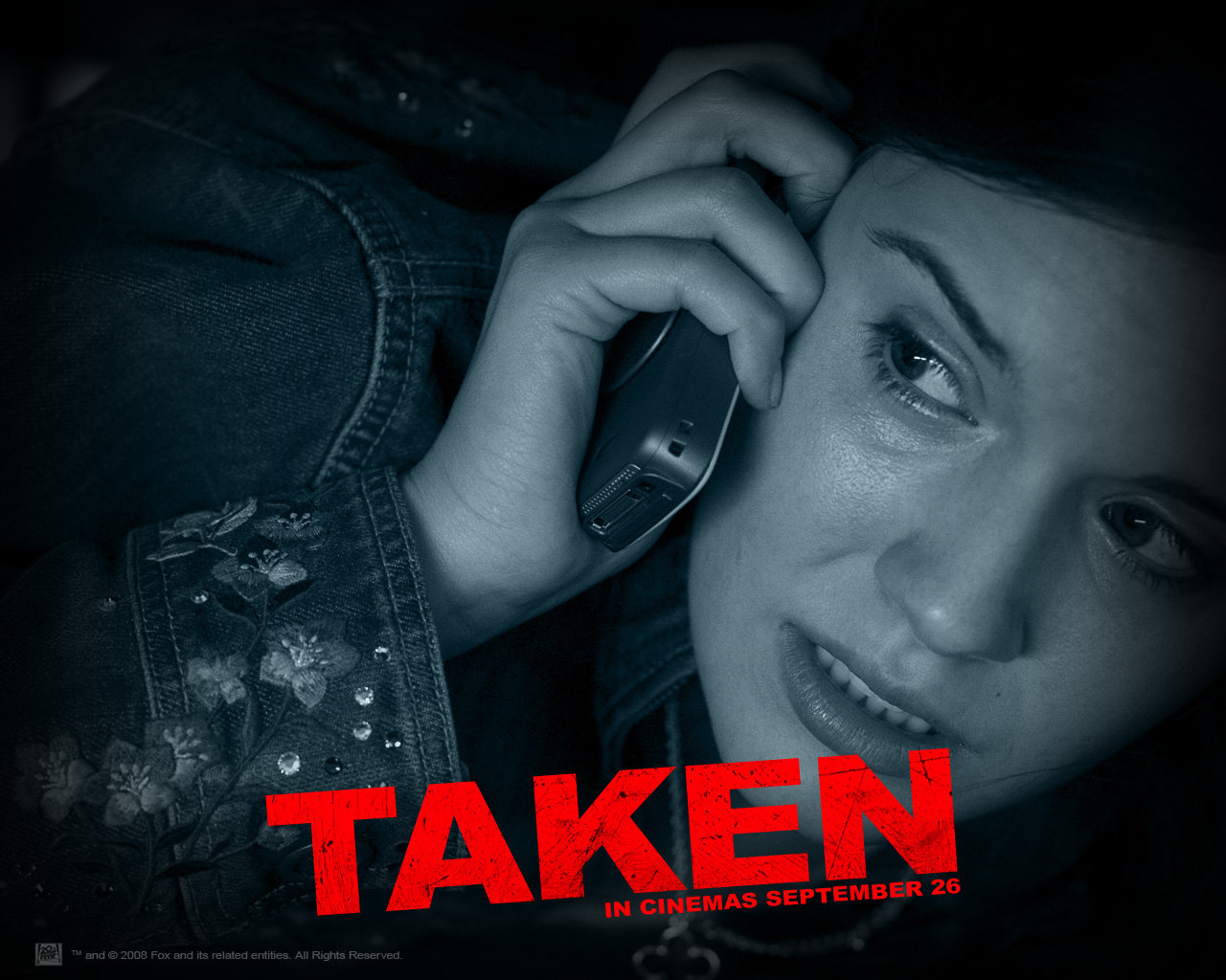
This can be achieved by the number of shots which are exploited throughout the film advertisement. Depending on the context in which the shots are used, they can illustrate location, status, character's reactions, age and emotions. An example of how my group and I followed some conventional shots of the thriller genre, is when the audience can see that the main girl is being dragged away by her feet. We aimed to include this shot as it was conventional and would be effective in reinforcing our genre, also by allowing the audience to see that the girls are not in control of their lives and are being manipulated. This iconic shot can be spotted in the Quarantine and Sorority Row films. In addition, we also applied this shot to the very end of our trailer as we felt it would work well in gripping the audience and make them unconsciously invest in their emotions, in particular the sense of irritation as the girls are so helpless, and intrigue as they will want to know what will happen to the girl.
It is within the trailer's aim to illustrate the characters, story line and genre with complete conviction and to make the audience feel enthralled by the trailer, enough so that they want to go and see it.
This can be achieved by the number of shots which are exploited throughout the film advertisement. Depending on the context in which the shots are used, they can illustrate location, status, character's reactions, age and emotions. An example of how my group and I followed some conventional shots of the thriller genre, is when the audience can see that the main girl is being dragged away by her feet. We aimed to include this shot as it was conventional and would be effective in reinforcing our genre, also by allowing the audience to see that the girls are not in control of their lives and are being manipulated. This iconic shot can be spotted in the Quarantine and Sorority Row films. In addition, we also applied this shot to the very end of our trailer as we felt it would work well in gripping the audience and make them unconsciously invest in their emotions, in particular the sense of irritation as the girls are so helpless, and intrigue as they will want to know what will happen to the girl.
One way in which we conventionally displayed the contrast of the character's dispositions was in our use of extreme close ups. Our reasoning for wanting to utilize a number of close ups was so that we could show the binary opposition theory as each of the shots would show the contrasting costumes and body language.

In light of binary opposites, the effectiveness of showing the girls in the country and the city helped us to further display the theory of binary opposites. When we were researching we watched the trailers for “Shark Night”, “Wrong Turn” and a film called “The Ruins”, in each of the trailer's narrative they placed their characters in two different locations, one where the characters start their day and the other where the event occurs which shifts the equilibrium. In terms of setting we decided to adhere to this convention as it is extremely effective in highlighting the severity of the situation which the girls find themselves in.
To add to the list of elements which we have adopted from real media products, the text shots which we inserted into Queensdown Warren was something that we felt would add to our trailer as they have the potential to increase the feelings of anticipation and work in reinforcing the narrative of our film.
“What started as a camping trip... Ended as... A fight for survival” is the sentence which we inserted into our trailer in three parts.
“What started as a camping trip... Ended as... A fight for survival” is the sentence which we inserted into our trailer in three parts.
Poster

There is an array of conventions which we have implemented to our poster, from the billing block to the lighting.
In the early stages of editing the final photo, light was one of the first issues that we addressed.
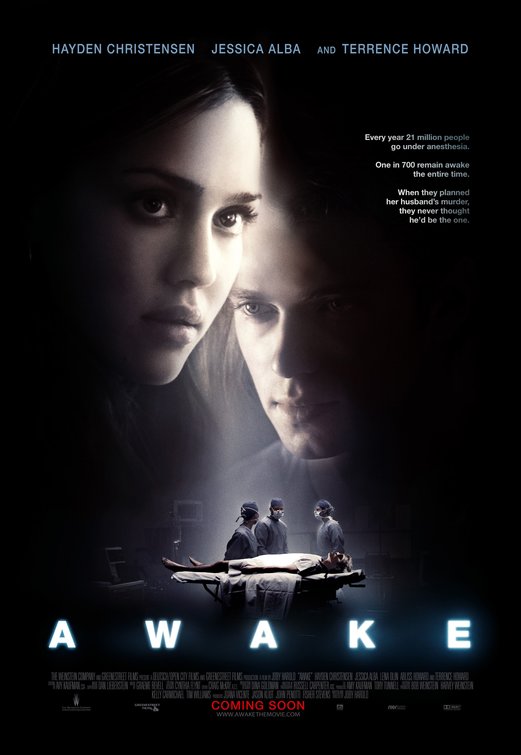
Having looked at other thriller posters whilst in the research process, we saw that the light was used to highlight who the victim or the protagonist of the film was. "Awake" starring Jessica Alba is one poster that we drew inspiration from and evolved the idea of using a spotlight the emphasize who our protagonist was.
On our poster we felt like the light focusing on the girl would work extremely well in highlighting her 'angelic-like' character in contrast to the two boys who are featured in the background. Furthermore, as she is surrounded by dark lighting and the figures behind her are focusing on her, it shows that she is going to be subjected to their attention and its represents how she is thinking that they are closing in on her.

Costumes was something which we did not take long to decide on, this is because the age of people that we were basing our film on were of the same age as we are. It was a quick decision to dress the girls in normal camping wear and the boys in a tracksuit. Similarly, these aforementioned outfits is what is commonly seen in films which carry the theme of youths. E.g. Kidulthood and Adulthood. To sum up, the antagonists will be dressed in the colour black or any other dark colour, like grey and they will be covering their faces with their hoodies. This is so that their identity is kept a secret and a mystery to keep the element of surprise and to stick to a convention. On the contrary, the victims will be wearing lighter colours which will act as a reinforcer to the audience of who the 'goodies' are.
Costumes was something which we did not take long to decide on, this is because the age of people that we were basing our film on were of the same age as we are. It was a quick decision to dress the girls in normal camping wear and the boys in a tracksuit. Similarly, these aforementioned outfits is what is commonly seen in films which carry the theme of youths. E.g. Kidulthood and Adulthood. To sum up, the antagonists will be dressed in the colour black or any other dark colour, like grey and they will be covering their faces with their hoodies. This is so that their identity is kept a secret and a mystery to keep the element of surprise and to stick to a convention. On the contrary, the victims will be wearing lighter colours which will act as a reinforcer to the audience of who the 'goodies' are.
Another contributing factor that we conventionally used on our
poster was text. We considered how to display our film title, film tagline and the billing block at the bottom of the poster. We stuck with the more conventional shot for our billing block and put the cast and crew's names all on one frame. It was a natural development that we went from a white billing block to a more sophisticated, professional grey billing
block, this also was effective as the colour grey did not distract you from the main picture.
Queensdown Warren can be noted for challenging certain conventions, such as the font style we exploited in all three of our media products. Our font - Didot, was chosen partly because of the "Q", it looked very regal and considering the name was Queensdown, we thought that the font accompanied the title well. However, from having looked at a large collection of thriller film posters, it is apparent that our font is not as bold and relevant to the thriller genre. Additionally, some could say that we have not applied any special animation effect to our title and this is becoming less conventional as the years go on and technology is becoming more advanced. As an instance, keeping in mind the genre and narrative of Queensdown Warren, if we were to do something like this assignment again we could include a blood animation or intelligent theme shown in the letters of the title. However, this year we believe that we did not require the use of animation of that level as space was an issue and we agreed it could make our products look busy.
Queensdown Warren can be noted for challenging certain conventions, such as the font style we exploited in all three of our media products. Our font - Didot, was chosen partly because of the "Q", it looked very regal and considering the name was Queensdown, we thought that the font accompanied the title well. However, from having looked at a large collection of thriller film posters, it is apparent that our font is not as bold and relevant to the thriller genre. Additionally, some could say that we have not applied any special animation effect to our title and this is becoming less conventional as the years go on and technology is becoming more advanced. As an instance, keeping in mind the genre and narrative of Queensdown Warren, if we were to do something like this assignment again we could include a blood animation or intelligent theme shown in the letters of the title. However, this year we believe that we did not require the use of animation of that level as space was an issue and we agreed it could make our products look busy.
No comments:
Post a Comment