Saturday, 9 March 2013

How A2 Differs From AS


These past two years have not just differed in terms of the project that was assigned to us, but in our knowledge of the planning, producing and editing stages. In comparison to last year, I feel that both individually and when combined as a group, we have reached a higher level of professionalism in our work. This is due to the fact that we have experimented a lot more with Final Cut Express in terms of effects, layering footage and synchronicity between our audio and visual clips.
Having now completed our A2 project, I think that it is evident our knowledge of what the expectations of thrillers are is much more concentrated and displayed in our work. We each understood that in terms of film openings, there is not as much pressure to produce feelings of great intensity, as that is something which would happen when the equilibrium shifts later on in the film. However, a trailer has to evoke the feelings of anticipation in a much shorter amount of time and therefore we knew we had to have a strong, impacting soundtrack to accompany the extreme fast paced close ups. Our preparation and planning was a lot more focused and in depth in A2 as there was a increased number of shots which we needed to include.  
In addition, we also featured in this years project, elements that we were extremely fond of in our film opening that we produced last year. For example at 0:30-0:40 in Daisy it starts with a very slow motion shot of a girl walking across the street, this editing technique is mirrored with the leaf falling at 1:15-1:18 in the Queensdown Warren trailer.


Other Programmes We Used
Another contrasting point which shows how A2 differs from AS is the additional programmes that we utilized this year and also how excessively we practiced on those from last year. 
It can be noted that Photoshop was used in order to perfect the images we gathered for our two ancillary texts. In our poster the is an obvious presence that this piece of software has been exercised due to the spotlight on the girl and a dark feathered edging, in which you can just see two male figures. Without the effects added, our poster would not have had the same depth of meaning. In addition, if we had been tasked with constructing a poster or magazine last year, we would have not been able to due to the fact we would not have had knowledge of how to use Photoshop. 
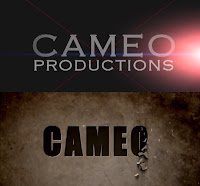
In addition to the software that we made use of, Adobe After Effects was a main, turning point in establishing how these two years of media have differed substantially. As shown in the pictures below, when we were developing our own company production logo in AS we did not think to use Adobe After Effects and as a result we ended up with a very basic design. However, in contrast to last year's logo designs, we incorporated the animated element to show how advanced in producing we had become and also designing. 


Filming Outside Instead of Inside
Our set for Daisy last year, consisted mainly of a cellar placed at the bottom of some stairs in one of our houses and whilst this was a very effective and appropriate location considering our plot, it did not allow us to show a variety of shots that we could have filmed in a bigger space or outside. The advantages however of filming indoors were that we were in control of lighting as there was no shadows to consider which natural light would produce. 

This year, we jumped at the chance to film outside as we wanted to experience what it was like and what things we needed to consider, for example a waterproof cover for the camcorders just in case it rained. The fact that we produced and directed our trailer outside in the country, was a great experience and made us wise to remember that we had to keep an eye on the sun. This was so that if we needed to re-film a scene we were aware of having a small time frame in which to carry it out. In this sense, filming in the nature reserve may all of us sharp on picking up on the trailer's continuity.


Used More Multimedia

As a group when organising our thoughts this year, we decided to document our progression and ideas on an online media presentation site called www.prezi.com. In addition, we have also laid out our thoughts on a interactive moodboard that allows ourselves and other people to follow the evolution of our researching stage. We have all discussed that our organisiational skills have improved in comparison to Year 12 and another example in which this can be seen is in our risk assessment table which highlighted how certain locations have particular health hazards.
Despite our improved understanding of having to be organised in the filming stage of our project, we also carried out some questionnaires in order to gain valuable information and insight into why people favour the films which they do and what urges them to go and see specifc movies.
Last year, we did no such research and chose our adopted genre based on trailers which we looked at and mutually liked.

Below is my group's final film opening and trailer...

Our Final AS Film Opening:


Our Final Thriller Film Trailer:


I, personally feel that this year has helped me to evolve into a more well-informed individual on how the media industry functions, with an improved knowledge about how to promote the Green Screen, Adobe After Effects CS6, Final Cut Express, Photoshop and GarageBand, as well as operating the camera. 
My interests have always been in editing as I am captivated how numerous shots which have no context, can then be combined together by music and visual effects to create a video that has the power to evoke feelings in a target audience. 
In conclusion, I feel much more capable in the software that we used and by having formed a well rounded picture of how to operate Adobe AE, I think that our work managed to develop in ways that we could not have achieved last year and give off elements of professionalism.

Friday, 8 March 2013

Titles and Font Analysis


Titles can come in various styles of font and size and can connote many things such as genre and emotions and when certain words or letters are emphasized it can highlight themes throughout the film. For example, Queensdown Warren just sounds like a place name and leaves the audience with the feeling that it is the location where things go unnoticed...
However, by stressing the War in Warren, gives the title a whole different feel and tells individuals that our film is going to be centered around a war that occurs within the woods. Whilst this is a clever emphasis on our title, we feel that the word war does not work well with our concept of the film and would sent out the wrong message. A war as it generally implies there being a number of people fighting on either side, whereas our three media products only depict one girl struggling to keep vast distance from two men and find her way out of the woodlands.


Each of these fonts connote something different, for instance the top image is one of the only times in which we experimented applying a grey tone to the title, and the colouring reminded us of a shadow which is effective in a thriller where a girl is scared of being hunted by men. Nevertheless we chose to discard this design as we felt adamant that we wanted to include the colour red as it signifies blood, fear and terror - all the feelings we want to attach to our products. 
Out of the following two images we liked how the two colours of the text and the background alternated, it worked in giving our promotional package a continuity to our colour scheme. In particular, when we were discussing the bottom caption of Queensdown Warren we were fond of how the words looked like they were caught in headlights, much like the shot in the trailer when the man stepped out in front of the girls' car, therefore this rendition of the title is effective in pointing out the narrative of our film and also in connoting the themes which we exploited through our trailer - danger and anger. Out of all the different designs that illustrate the film title, this is the one I most prefer as it has a lot of connotation attached to it.

Thursday, 7 March 2013

The Promotional Package


Promotional Packages are what A-list movies depend upon to get their box office sales and the more effective the package, the more recognition and money a film will make. Promotional packages can be shown in a number of places and ways, for example, trailers can be shown at the cinema before the film starts, on the television and on the internet. Posters can often be seen on billboards, on the side of buses, outside the cinema, in magazines and on the internet. Similarly, covers of film magazines are published on websites, apps and obviously, they can be bought in shops.

Our Promotional Package
When planning our three media products we had to constantly think of what our promotional package as a whole will signify. Our aims and intentions of our packaging was to clearly show a connection and our film's message - that fate does not discriminate and that we cannot anticipate every ordeal that life throws at us, it is the influence of others which is capable of making our own plans for our life turn into insignificance.  

Trailer


Poster


Magazine Cover


Wednesday, 6 March 2013

Other Film's Promotional Packages


As promotional packages are what generates interest and entice people to go and see films, it is extremely important that they are pitched correctly to the right target audience. Unlike our promotional packages, some films do not just rely on the trailer, film poster and a front cover on a film magazine, instead they launch things from toys to socks and even bed sets. This is extremely effective in provoking interest within people as it offers them more chances to go on the journey with the characters. Also marketing products such as the previously stated, work well in maintaining the audience's attention throughout all of the sequels. An example of where this has happened is with the Harry Potter franchise...


Merchandise such as these appeal to different age groups, the bed sheets and the collectible toys can be seen to address the 10+ years, whereas an item such as the wand and a fan website and even the Harry Potter ride is appealing to those who are of an older age. Each of these products is an advertising technique to make its intended audience to feel like they are a part of the film or brand and are on the journey that Harry, Ron and Hermoine are on. 


This is the Harry Potter wizards collection website and by clicking on the link given it will take you straight to the home page where you have the chance to go on a tour of the portrait gallery, also where you could practice the wand gestures which are featured in the films. This is a clever strategy as it gives the audience the chance to copy what their favourite characters do, in addition, it makes the audience feel like they are going behind the scenes of the film, making the website feel very personal to them. 


This is a screen grab of the Warner Bros. Studio Tour website which acts as a portal for dedicated fans to go buy their tickets and experience a tour around a museum which contains memorabilia -  from the actor's costumes to the the model of Hogwarts School of Witchcraft and Wizardry... This most effectively appeals to the audience's want to get involved in the sequels as it gives them a chance to get within very close proximity of the real items, set and costumes that were used when producing the film.


Having the franchise reach such popularity on a universal scale, it led to this film having their own set up at Universal Florida Rides of Adventures. This ride physically pulls fans into the wizarding world and the footage of Harry Potter speaking to them, is great in giving them a personal experience with the eponymous hero himself. 

Other advertising products include:
Harry Potter Soundtracks
Harry Potter monopoly, as well as other games 
Harry Potter camp

Creating the Official Animated Film Title


As Adobe After Effects is a highly detailed programme and the help of tutorials was needed, we scouted online on Youtube to find a video demonstration of an effect that we could put onto our film title so that it would look appropriate to our genre.

This following link is the one in which was used to create our final animated film title shot -

http://www.youtube.com/watch?v=0Rh5wmtEBrY

Due to the fact that we were using a free month trail of Adobe After Effects CS6, it meant that the exact effect that was displayed on the tutorial could not be completely replicated. This is one disadvantage that we experienced during our time working with the programme. 

And here is the final product which we edited into our trailer:


Monday, 4 March 2013

Working with Adobe After Effects


Adobe After Effects is an incredibly established piece of software which people in the media industry use, today. Its array of endless effect options allow you to create unique and intricate files which have that cinematic look which you see in all of the films, much like Harry Potter which can be seen in the collage above.

After having first downloaded the programme, it was evident that that programme could be a disadvantage to most if you do not have an induction into the Adobe Ae. In order to know your way around the software you would have to view tutorials on Youtube and build your knowledge from there on wards.
Here are some of the tutorials which I looked at:-


I found that with the extra guidance that Youtube tutorials provided was of enormous help and we would not have been able to create an animated title effect otherwise which would have not made our film trailer look as professional.

Magazine Feedback


Here is our final Magazine which we showed to people in order to gain some feedback -


One person responded to our magazine by saying- 

"I like the idea which this magazine cover promotes - that urban people find the countryside threatening as they are taken out of their comfort zone. It reminds of films like Deliverance and Straw Dogs."

- Simon , 54

This feedback was very helpful in allowing us to see if we had done a successful job... As they likened our concept of the film to previous real media products, it enabled us to say that we have effectively been using conventions of films. 


It is in this video that we got feedback on aspects ranging from the text used, to what the positioning of the girls are suggesting. We were really pleased to get mainly positive feedback as it gave us reassurance that we had constructed an emotionally and conceptually successfully film trailer. Despite the encouraging thoughts on our work; as mentioned in the video, people believed that the only fault was how the title "Queensdown Warren" was not entirely visible due to one of the character's hoodies being too dark. After knowledge of this had been pointed out to us, we attempted to address the issue by highlighting the text in bold, making the colour lighter and by enlarging the size of the font.  However, we were only able to edit the text to a certain extent, this is because we would have had to change the font entirely and this is not something we expressed a desire to do as it would break the continuity with the trailer, poster and magazine.